Closy

Closy

Empathize

Empathize

ideate

ideate

prototyping

prototyping

testing

testing

prototype

prototype

Boost the creation of a valuable and enriching close circle, helping people build meaningful relationships.

Boost the creation of a valuable and enriching close circle, helping people build meaningful relationships.

Project type: End-to-end app + branding

Overview: The human ability to connect is threatened by technology and isolation, affecting people’s meaningful relationships.

Role: UX/UI Designer

Tools: Figma, FigJam, Notion, Tally, Paper, and Pen

Duration: Q2 2024

Project prototype test

Project prototype test

Empathize

Empathize

Why is it essential to understand our emotions? How do we address these challenges uniquely?

IN THIS SECTION

1. The problem

  1. How is the problem currently addressed?

  2. Research plan

  3. Interviews

  4. Questionnaire

  5. The 5 whys

  6. Value Proposition Canvas

1. The problem

  1. How is the problem currently addressed?

  2. Research plan

  3. Interviews

  4. Questionnaire

  5. The 5 whys

  6. Value Proposition Canvas

1. The problem

  1. How is the problem currently addressed?

  2. Research plan

  3. Interviews

  4. Questionnaire

  5. The 5 whys

  6. Value Proposition Canvas

The problem

The problem

Today, facing loneliness has become a significant challenge for many people. Despite living in a hyper-connected era thanks to technology, many people feel more isolated than ever. Studies show that a considerable portion of the population experiences loneliness for long periods, especially young people under 24.


This persistent feeling of loneliness not only affects emotional well-being but also has serious implications for individuals' physical health and economic stability.


In light of this, promoting innovative solutions that foster meaningful relationships is necessary, challenging the paradoxical loneliness of our digital age.

How is the problem currently addressed?

How is the problem currently addressed?

How is the challenge of maintaining personal relationships addressed?


Most apps today aim to connect new people: Tinder, Bumble, Looplan, Meetup. These apps make it easy to meet people, but that’s where it ends. The reality is that often, these new connections are lost over time. We don’t nurture them enough.


Here, the gap is clear.


Current apps forget something crucial: deepening and caring for the relationships we already have. They don’t focus on what really matters: building strong and lasting bonds. There’s a big opportunity for a solution that focuses on quality over quantity in our relationships. A tool that motivates us to cultivate and preserve our most valuable connections.

Research Plan + Interviews

Research Plan + Interviews

The interview process starts with creating a research plan. It outlines 6 key components:


  1. Project/Problem Background

  2. Research Objectives

  3. Specific Objectives

  4. Research Questions

  5. Methodologies

  6. Hypotheses

The interview process starts with creating a research plan. It outlines 6 key components:


  1. Project/Problem Background

  2. Research Objectives

  3. Specific Objectives

  4. Research Questions

  5. Methodologies

  6. Hypotheses

Research Objectives

  • Explore how individuals perceive and experience loneliness.

  • Analyze how users try to deal with loneliness using current products.

  • Identify users' expectations and desires for new solutions to improve personal connections.

  • Investigate the dynamics of social relationships and how they influence the feeling of loneliness.

1-1 Interviews

1-1 Interviews

The interviews were conducted both in-person and via digital platforms. This process lasted a week, selecting participants and conducting the interviews.


Afterward, we compiled and analyzed the information obtained to create the final report. A total of 10 interviews were conducted in record time.

User 1

User 2

User 3

User 4

User 5

User 6

User 7

User 8

User 9

User 10

User 1

User 2

User 3

User 4

User 5

User 6

User 7

User 8

User 9

User 10

User 1

User 2

User 3

User 4

User 5

User 6

User 7

User 8

User 9

User 10

Questionnaire + Responses

Questionnaire + Responses

A questionnaire was created with key questions for the project. A survey was distributed to young people in Spain and Latin America, and we received 150 responses.


The survey was created using Tally, as it offered us a way to display data we liked and also a survey that was engaging and easy to answer. This survey was key to the project’s analysis and direction.

3 Key Facts

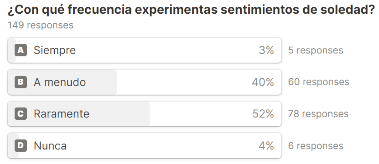
These results confirm that most people suffer from loneliness.


The direct question about loneliness confirmed our initial hypothesis, showing it is a widespread issue among participants. This finding validates our research direction and the development of solutions focused on connecting and alleviating loneliness.

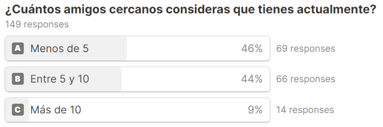
These results confirm a study by British anthropologist Robin Dunbar.


The findings support Robin Dunbar’s studies on social relationships, indicating that people tend to maintain a limited circle of close friends, around the number 5. This underscores the importance of cultivating meaningful connections in the fight against loneliness.

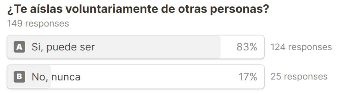
These results confirm that people isolate themselves, which leads to difficulty maintaining long-term relationships.


This highlights the need for a digital product that promotes regular interaction and the care of personal relationships.

3 Interesting Facts

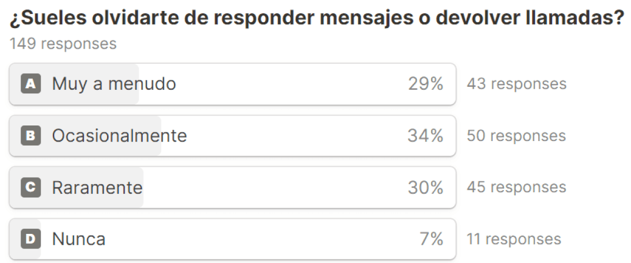
The survey revealed that a significant majority tend to forget to respond to messages.


This highlights an area of opportunity to develop solutions to improve the management of personal communications and prevent the deterioration of relationships through neglect.

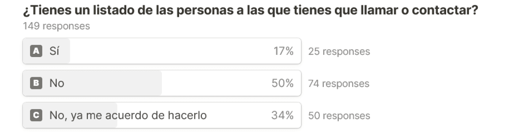
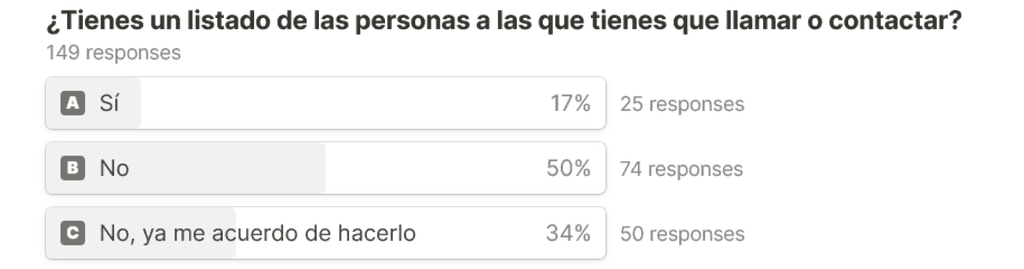
Results show that many people do not keep track of the contacts they need to communicate with.


Most respondents do not keep track of the contacts they need to communicate with, and those who do lack a specific tool to manage it. This finding points to the need to create an application that facilitates the tracking of pending communications and fosters more consistent connections.

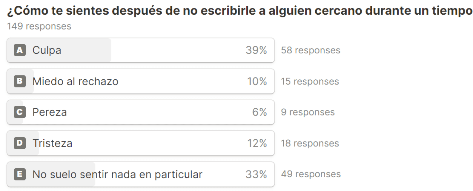
The survey indicates that a considerable proportion of the participants experience guilt.


Respondents experience guilt for not maintaining contact with people close to them for extended periods of time.This underlines the importance of designing mechanisms that encourage regular communication, helping to overcome emotional barriers and strengthening personal bonds.

The 5 Whys

The 5 Whys

After applying the “5 Whys” (in this case only 3) and analyzing interviews and surveys, we discovered that neglecting relationships was a key problem for our users. This insight led us to focus the app on strengthening personal bonds.


With this approach, we started to design and think about the solution. Making it easier to maintain relationships, thus offering real and practical value to users to improve their social lives.

Value Proposition Canvas

Value Proposition Canvas

The Value Proposition Canvas allows us to identify the needs of our users, young people looking to improve their social interactions. This process helped us define how we can alleviate their sense of isolation and strengthen their personal connections.


Our value proposition focuses on “we help young people who feel lonely to improve their relationships by deepening their relationships with their close social circle”.

El Value Proposition Canvas nos permite identificar las necesidades de nuestros usuarios, jóvenes que buscan mejorar sus interacciones sociales. Este proceso nos ayudó a definir cómo podemos aliviar su sensación de aislamiento y fortalecer sus conexiones personales.


Nuestra propuesta de valor se centra en "ayudamos a los jóvenes que se sienten solos a mejorar sus relaciones profundizando con su círculo social cercano".

The Value Proposition Canvas allows us to identify the needs of our users, young people looking to improve their social interactions. This process helped us define how we can alleviate their sense of isolation and strengthen their personal connections.


Our value proposition focuses on “we help young people who feel lonely to improve their relationships by deepening their relationships with their close social circle”.

Ideate

Ideate

Before shaping any project, it is essential to organize and plan every step, similar to following an IKEA manual. This phase lays the solid foundation for future development.

Before shaping any project, it is essential to organize and plan every step, similar to following an IKEA manual. This phase lays the solid foundation for future development.

IN THIS SECTION

1. Site Map

2. Task Flow

3. User Flow

4. Lo-Fi Wireframes

1. Site Map

2. Task Flow

3. User Flow

4. Lo-Fi Wireframes

1. Site Map

2. Task Flow

3. User Flow

4. Lo-Fi Wireframes

Site Map

Site Map

This site map of the application reflects the organization of Closy's features. It provides a clear scheme for ordering the application's functionalities and facilitates the definition of the sequence of access to them.


This step ensures that each section of the app is clearly defined before starting the design process, which establishes a logical and accessible structure for users. It is crucial that the user can access a functionality with as few clicks as possible.

Task Flow

Task Flow

Task flows are crucial for clearly establishing the path the user will follow from the start to the end of an action within the app. This methodology ensures that all necessary screens for each process are designed, avoiding missing important steps that could affect the user experience.


Additionally, by having a complete mapping of these task flows, it becomes easier to design not only the main screens of each feature but also the transitions and animations between them. This allows for a cohesive and smooth user experience, considering every detail of the user journey within the app.

User Flow

User Flow

The user flow is essential for keeping the app organized, allowing us to place the features in each wireframe and determine access to each one. This prior organization is fundamental to ensuring a consistent and effective user experience.


Once the flow is established, the next step is to replace the features with low-fidelity wireframes. This process further refines the user flow, providing a detailed visual guide that clarifies the user's journey through the app.

Lo-Fi Wireframes

Lo-Fi Wireframes

The first phase of our creative process is a drawing marathon. Every thought, every possible solution is turned into lines on paper. There’s no limit: the more ideas, the better. After this visual brainstorming, we select the best of the best to create a wireframe MVP.


This selection is then digitized in Figma, where we start considering aspects like size and functionality, keeping the focus on the essence of each element without getting distracted by design details yet.


Afterward, the wireframes are meticulously organized, and each part is named, preparing them to be the basis of our user flows. This stage not only speeds up the wireframe development but also ensures a smooth transition to high-fidelity designs. By focusing first on the app’s structure and navigation, we establish a solid foundation for detailed design, facilitating future work and ensuring no key functionality is lost along the way.

Prototyping

Prototyping

This is the crossing point of the double diamond, where research and creativity collide, bringing the project to life. It’s the magical moment when the vision becomes reality.

This is the crossing point of the double diamond, where research and creativity collide, bringing the project to life. It’s the magical moment when the vision becomes reality.

IN THIS SECTION

1. Mood board

2. Logo

3. UI-Kit

4. Hi-Fi Wireframes

5. Protorype v1

1. Mood board

2. Logo

3. UI-Kit

4. Hi-Fi Wireframes

5. Protorype v1

1. Mood board

2. Logo

3. UI-Kit

4. Hi-Fi Wireframes

5. Protorype v1

Mood board

Mood board

For the app’s mood board, we selected elements that evoke a garden full of life, with robust plants and shelves overflowing with greenery. We aimed for green tones that inspire peace and growth, avoiding anything too childish, so the app reflects the calm of a blooming plant and promotes healthy relationships.


We opted for modern iconography and the typography, in this case “Outfit,” a geometric sans serif chosen for its ability to balance joy and seriousness, making it accessible to all users. This typeface is part of the entire branding of the app.

Logo

Logo

Initially, the app aimed to focus its logo design on a concept of a dot and aura, symbolizing people coming closer into your life. However, the inspiration drastically shifted when considering an analogy with plants. This conceptual shift directed the design toward greener and more vibrant elements.


Several options were on the table: the shape of a leaf or even an entire plant, defining the app’s name. In the end, the app settled on a plant logo and name.

UI-Kit

UI-Kit

Initially, the app aimed to focus its logo design on a concept of a dot and aura, symbolizing people coming closer into your life. However, the inspiration drastically shifted when considering an analogy with plants. This conceptual shift directed the design toward greener and more vibrant elements.


Several options were on the table: the shape of a leaf or even an entire plant, defining the app’s name. In the end, the app settled on a plant logo and name.

Hi-Fi Wireframes

Hi-Fi Wireframes

In the Hi-Fi wireframe stage, every detail comes to life with precise colors, typography, and interactive elements, focusing on both aesthetics and user interaction. This process ensures that the interface is not only functional but also visually appealing, aligned with the expectations and needs of the final users.


Focusing exclusively on mobile devices was a strategic decision to optimize resources. Consistency with branding is essential at this stage, ensuring that every component faithfully reflects the brand’s essence, making the product feel more personal and valuable. This balanced approach between functionality and aesthetics is designed to offer a superior mobile experience, meeting the project’s goals and the final users' expectations, based on everything we’ve learned about the project so far.

Prototype v1

Prototype v1

Testing

Testing

Testing

Testing, testing: 1, 2, 3, are you there, users?

Testing, testing: 1, 2, 3, are you there, users?

IN THIS SECTION

  1. User Testing

  1. Revisions

  1. User Testing

  1. Revisions

  1. User Testing

  2. Revisions

User Testing

User Testing

1-1 interviews were conducted in person, using the mobile prototype to explore each designed feature in depth.


We ensured that no aspect was overlooked. The goal was to deeply understand how users interacted with the app, particularly focusing on validating the effectiveness and intuitiveness of navigation and overall usage.


Special attention was paid to accessibility issues and users’ understanding of the app’s elements. Through more focused questions, we obtained feedback on each interface component, especially those that raised doubts during the prototyping phase.

Participants

Participants

Female

30 years old (Chilean, lives in Barcelona)

Jr. Product Designer

Very forgetful regarding her relationships.

Chico

25 years old (Cuban, lives in Barcelona)

UX Designer

Has a small circle. Diagnosed with autism.

Female

30 years old (Barcelona)

UX/UI Designer

Work stress, her social encounters are usually accidental.

Insights

  • Visual appreciation: Users highly appreciated the illustrations and overall design of the app.

  • Minimalist touch: Users are grateful for having such a harmonious and minimalist app, which helps them want to use it.

  • Confusion in specific elements: Some elements and actions within the app, like the plant bars, as well as the challenge mechanics and level system, cause confusion.

  • Information retention issues: Despite understanding the onboarding and other initial instructions, users tend to forget the information quickly.

  • Intuitiveness and clarity in challenges: Users understand how to collect rewards but confuse daily challenges with weekly ones; claiming rewards isn’t always obvious.

  • Technical and design issues: Need for technical and design adjustments to solve usability problems and improve the user experience.

Apreciación Visual: Las ilustraciones y el diseño general de la app son muy apreciados por los usuarios.

Toque minimalista: Los usuarios agradecen tener una aplicación tan armoniosa y minimalista, esto les ayuda a querer usar la app.

Confusión en Elementos Específicos: Algunos elementos y acciones dentro de la app, como los las barras de la planta, así como la mecánica de los retos y el sistema de niveles, generan confusión.

Problemas de Retención de Información: A pesar de entender el onboarding y otras instrucciones iniciales, los usuarios tienden a olvidar rápidamente la información proporcionada.

Intuitividad y claridad en retos: Los usuarios captan cómo recoger recompensas pero confunden retos diarios con semanales; reclamar premios no siempre es obvio.

Cuestiones técnicas y de diseño: Necesidad de ajustes técnicos y de diseño para solucionar problemas de usabilidad y mejorar la experiencia de usuario.

Opportunities

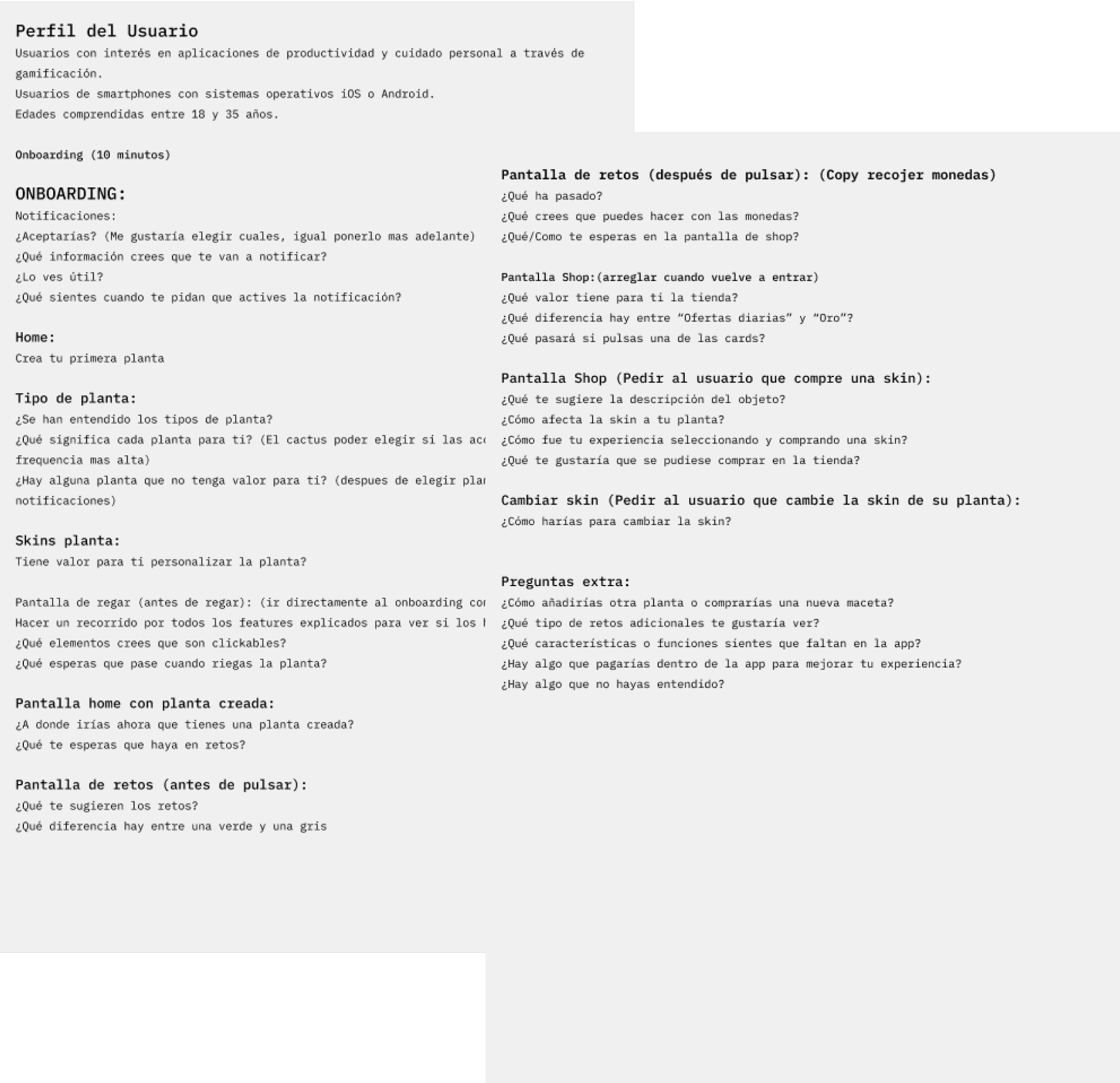
  • Onboarding optimization: Improve clarity and information retention in the onboarding process.

  • Clarification of confusing elements: Review and simplify the elements and actions within the app that caused confusion, ensuring that functionality is intuitive.

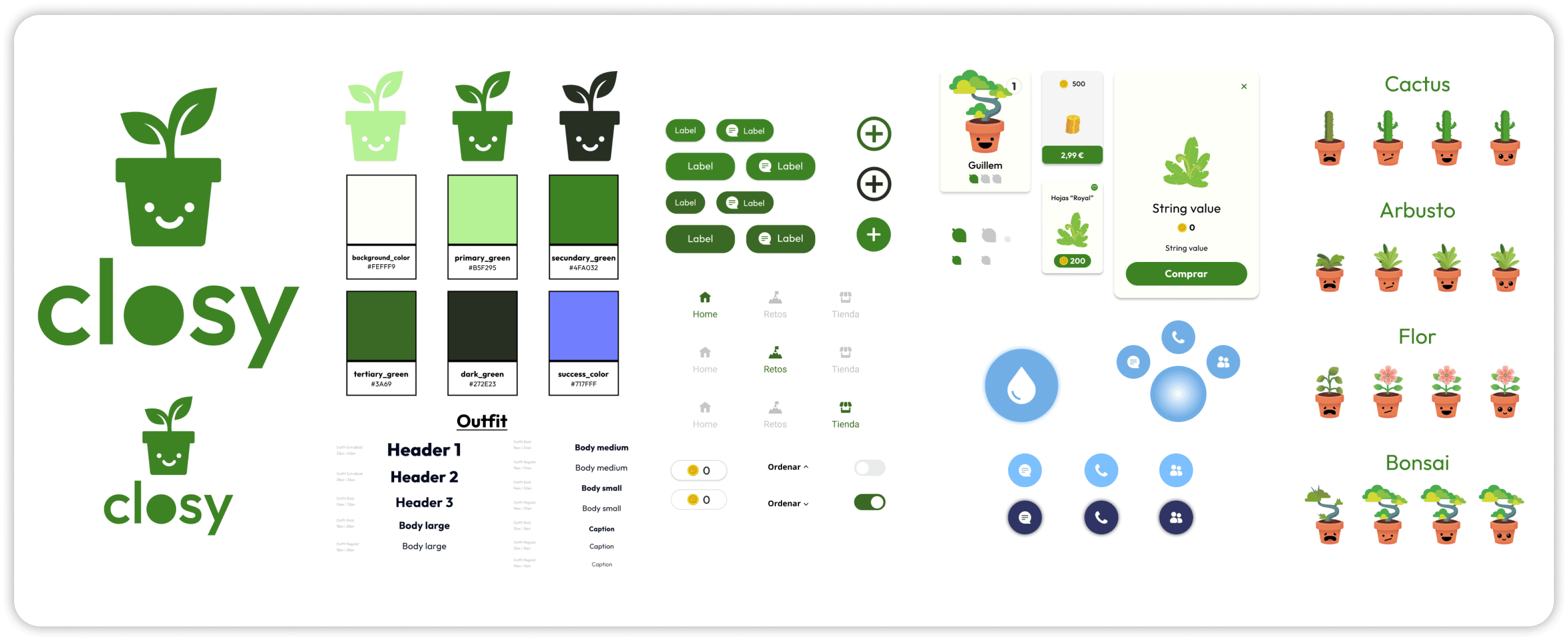
  • Incorporation of customization: Offer more customization options for each plant, both in visual appearance and in how the app is used.
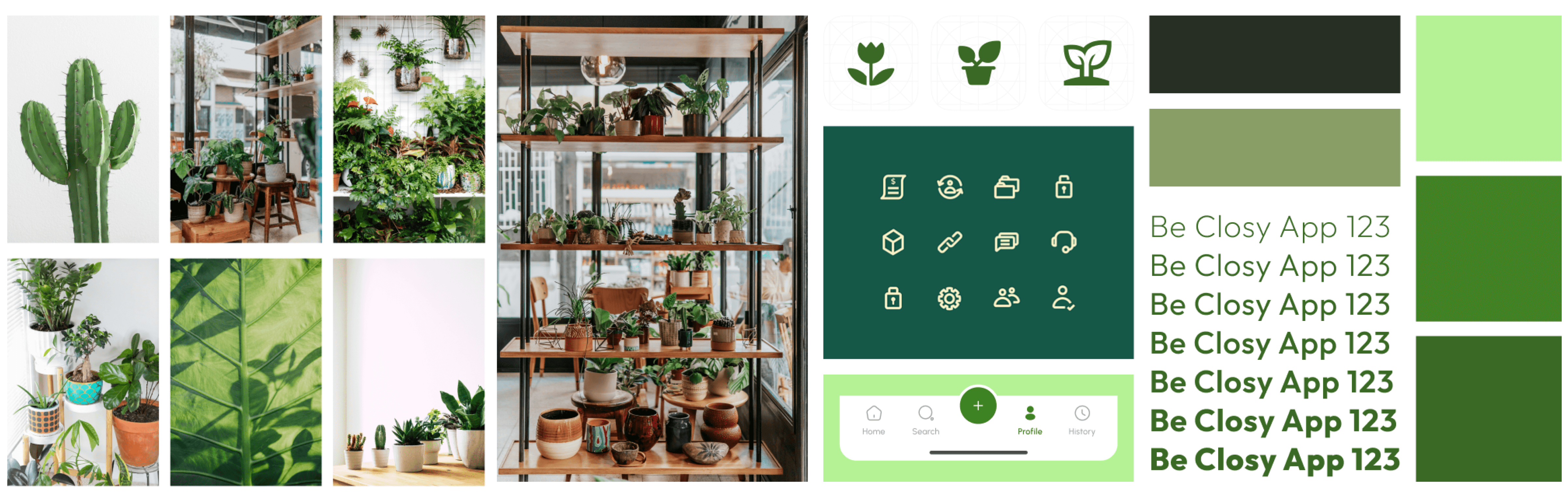
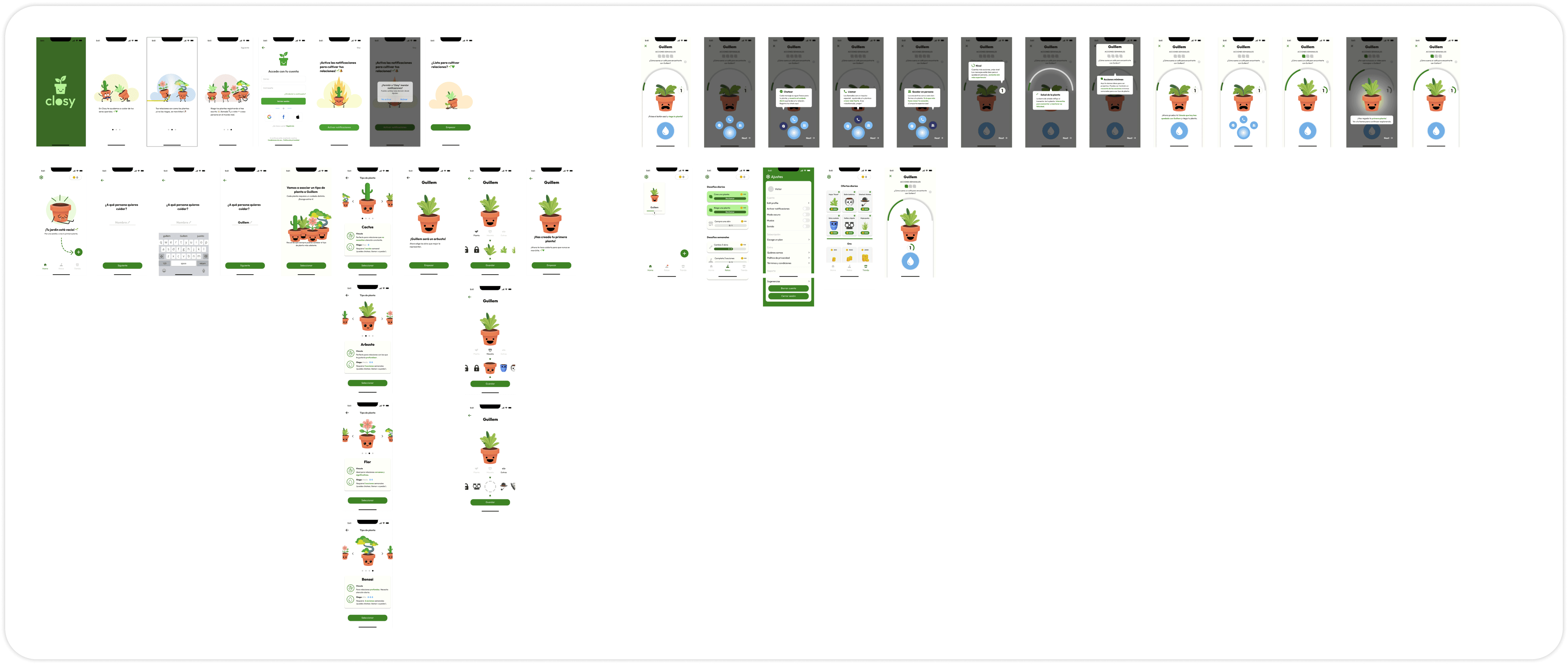
Revisions

Revisions

Onboarding


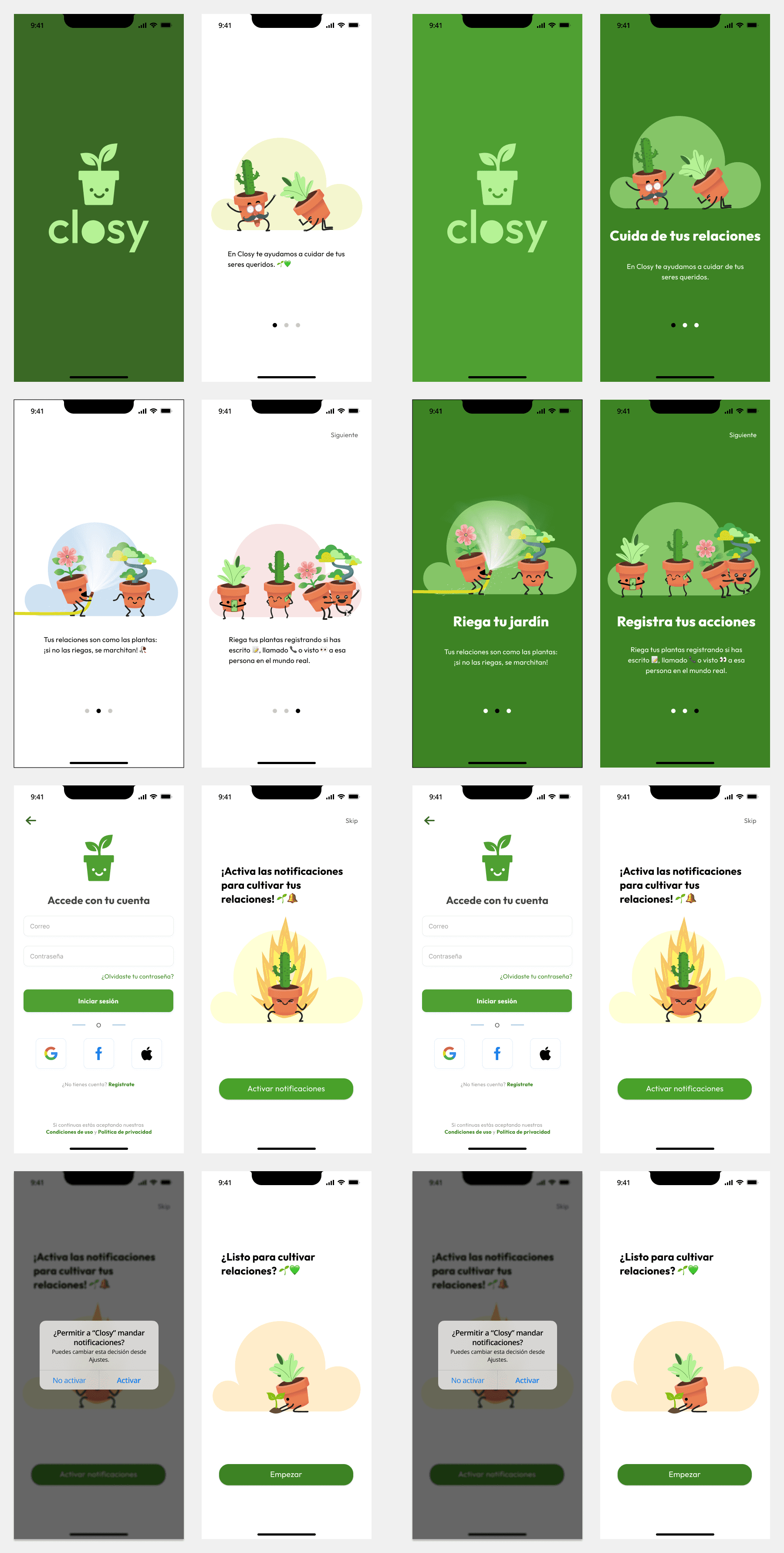
Closy’s onboarding has been changed to Closy's main color, giving a warmer welcome and bringing the user closer to Closy’s branding from the start. Aiming for a cozy and attractive first impression for users.
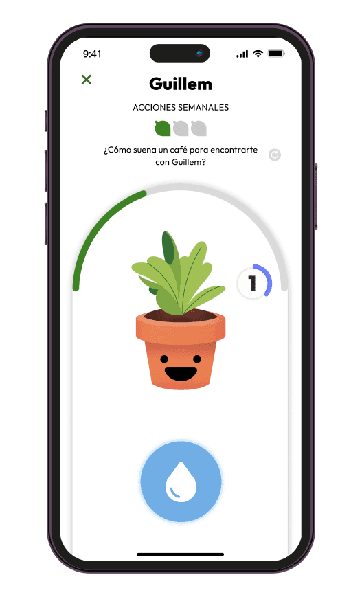
Plant screen


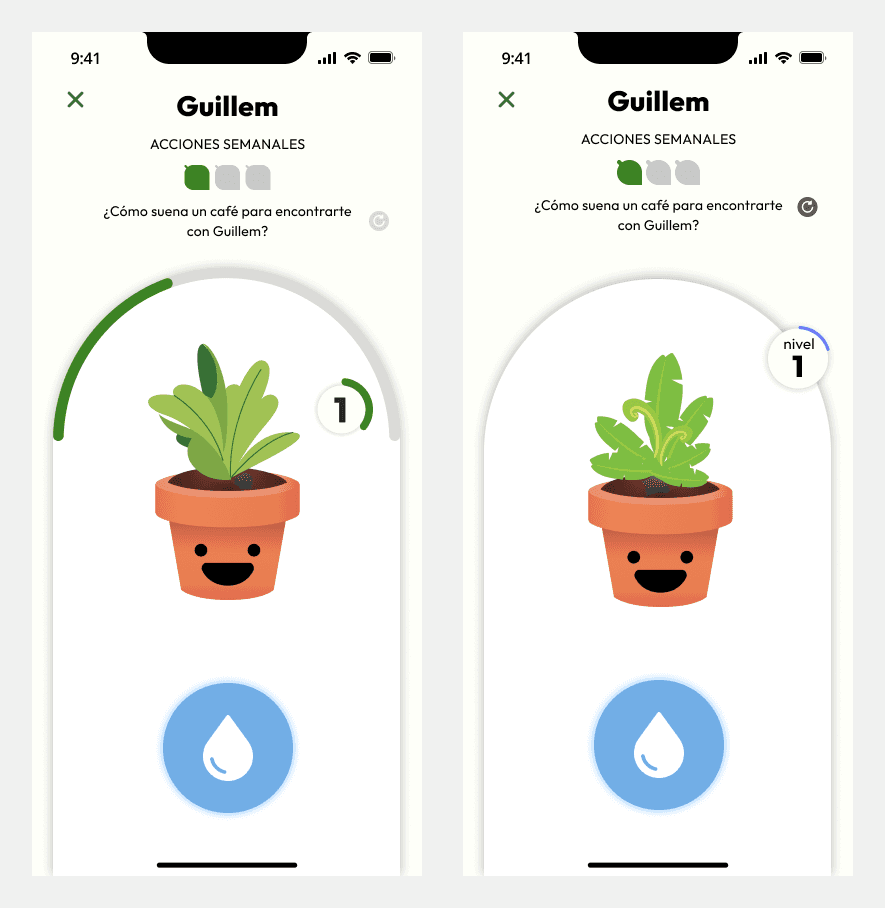
The plant screen was where users found the most difficulties, due to poorly designed elements. We opted to remove the status bar. Since the combination of minimal actions along with the visualization of the plant’s mood and health itself makes an additional status bar unnecessary. Previously, users misinterpreted this bar as a level indicator, expecting some event when completing it, rather than seeing it as a reflection of the plant’s status.
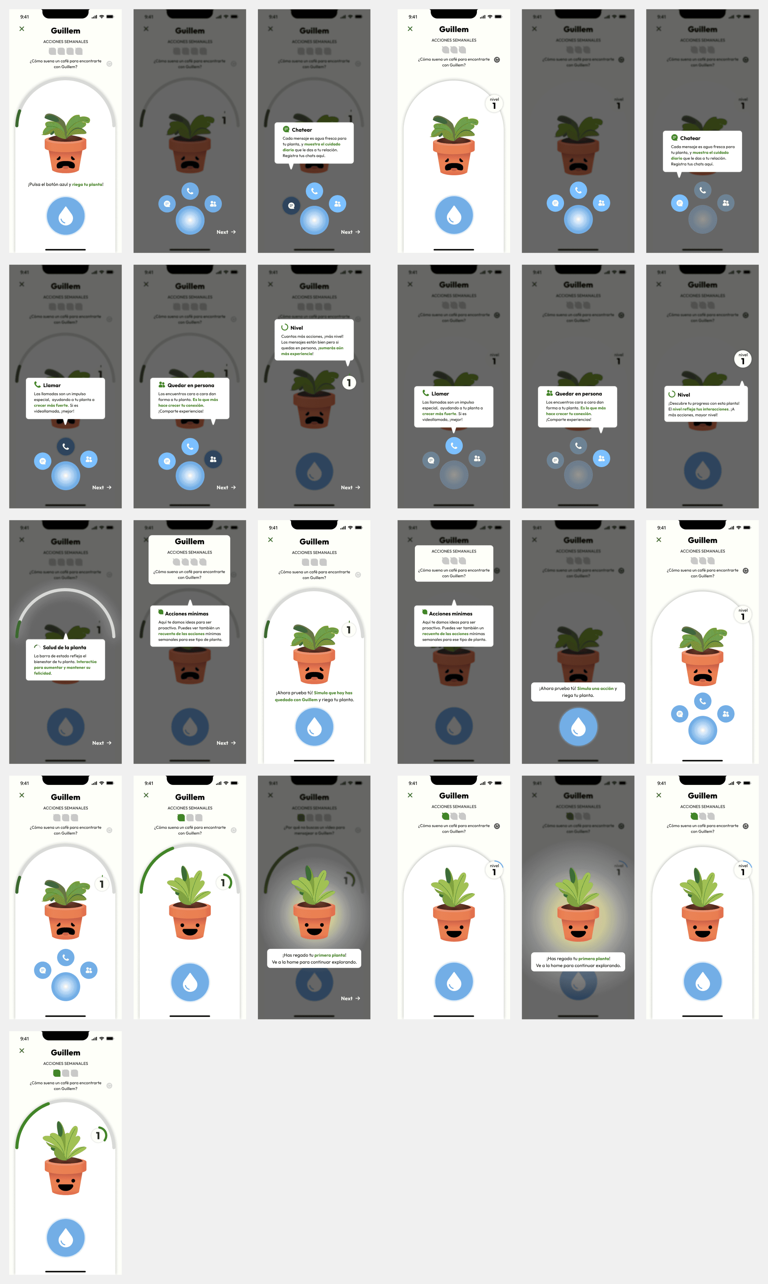
Watering tutorial


Due to the modification of the plant’s UI, it was necessary to update the tutorial to reflect these changes. Additionally, some copy of the messages was adjusted, and the interface of the pre-watering message was redesigned. Users often ignored the message and didn’t understand what they had to do. These modifications aim to ensure that users clearly understand how and why to water their plants in the Closy app.
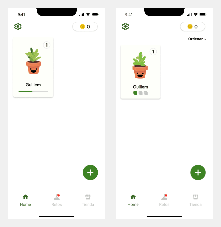
Home


A filtering system has been added to organize the plants by level, name, type, and status. With the removal of the status bar in the plant UI, a count of actions performed during the week was introduced, allowing users to quickly see the care provided to each plant without needing to access its individual profile.
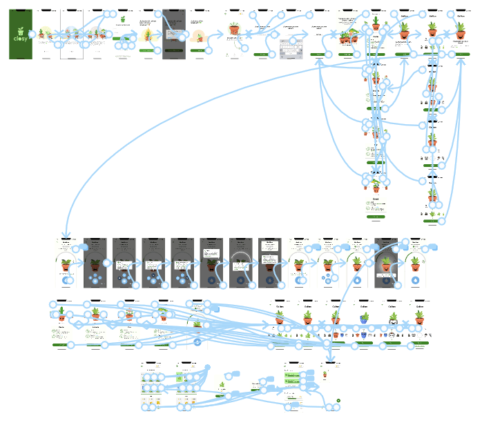
Challenges screen


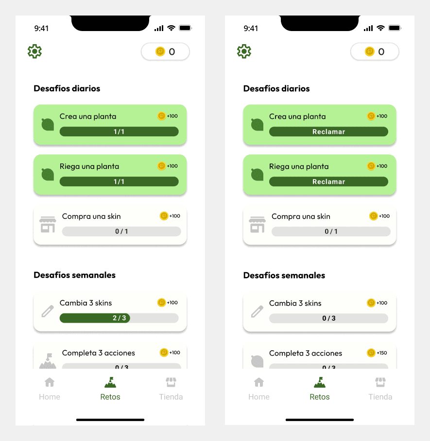
Users commented that this feature added a lot of value to the app. However, there was confusion when completing a challenge, as they didn’t

Final prototype (DEMO)

Final prototype (DEMO)

Our society urgently needs to strengthen its social relations

Our society urgently needs to strengthen its social relations

GET IN TOUCH

victorsaizalfageme@gmail.com

+34 633 371 552

FOLLOW ME

Designed by Victor Saiz

GET IN TOUCH

victorsaizalfageme@gmail.com

+34 633 371 552

FOLLOW ME

Designed by Victor Saiz

GET IN TOUCH

victorsaizalfageme@gmail.com

+34 633 371 552

FOLLOW ME

Designed by Victor Saiz